Working with data from the Bureau of Labor Statistics, part 1
2014 Census of Fatal Occupational Injuries, or how to scrape data from pdfs
Skip to final pictures
See part 2 of Working with data from the Bureau of Labor Statistics
Introduction
The Bureau of Labor Statistics (BLS) website has many datasets pertaining obviously
to labor statistics - in particular, the main subjects are:
- Inflation and Prices
- Employment & Unemployment
- Pay & Benefits
- Spending & Time Use
- Productivity
- Workplace Injuries
- International
- Regional Resources
There are lots and lots of data files on the website (it IS a government statistics organization, after all), for any
data junkie to be quite happy with. However, while some of the datasets are in relatively clean Microsoft Excel
format, the majority are either contained in tables within PDF files, or in easy-to-parse but very cryptic plain text
files.
2014 Census of Fatal Occupational Injuries
For the first part of this section, I'll give an example of working with one of the BLS's pdf files. I will investigate
Workplace Injuries, specifically focusing on the number of different types of fatalities in each industry. The primary
file is "cftb0286.pdf", and can be found here, under
"2014 Census of Fatal Occupational Injuries (preliminary data) -
Industry by event or exposure, 2014 (PDF 272K)".
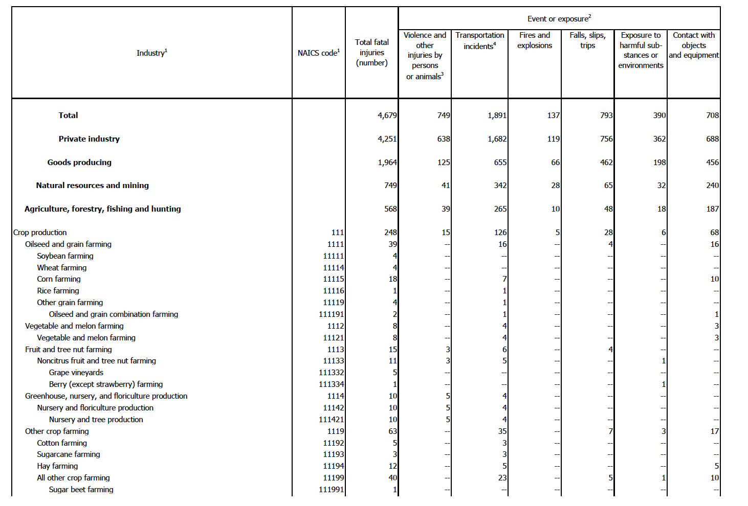
Here is the first page of the 35-page document:

Here are some other sections from the same document:
from page 12:

from page 31:

from page 33:

What is wrong with these images??
- "Total" column is unclear
If you look closely, you can see some quirky things with the data.
First, we can see that the table has 9 primary columns: Industry; NAICS code; Total fatal injuries; Violence and other
injuries by persons or animals; Transportation incidents; Fires and explosions; Falls, slips, trips; Exposure to
harmful substances or environments; and Contact with objects and equipment. NAICS stands for the North American
Industry Classification System, and is just the numeric code for each industry/sub-industry/etc. Based on the name, I would assume "Total"
to be the sum (or total) of the last 6 columns that give the various fatality causes. However, we can
very quickly see that this is not the case, if you look at the first example and the rows for Soybean farming, Wheat farming,
Corn farming, Rice farming, etc. What total is, then, is quite cryptic.
- Hierarchical relationship between industries
Second, we see that there are varying levels of industries within the table, with levels differentiated by the amount of
indentation in the industry field name as well as the number of digits in the NAICS code field. We can see this in the first example,
where Crop production contains Oilseed and grain
farming, and Oilseed and grain farming contains Soybean farming, Wheat farming, Corn farming, Rice farming, and Other grain farming, and so on.
I would expect that the sub-industries numbers should add up to make the priamary industry's numbers, but
this is not the case. If we look at the 4th example, we see that Executive, legislative, and other general government support
has 4 total deaths, while its sub-industry, Public finance activities, has just 1 total death. We can see this same issue throughout all
of the images, and in the entire original pdf table. By including every row, we may inadvertently be double-counting. Additionally, we
should only make comparisons within the same industry hierarchical level. It would not make sense to compare the entire Natural
resources and mining industry with the sub-sector Sugar beet farming.
Third, there are numerous duplicated rows. In the 4th example, the Public administration row is repeated twice.
In that same example, the Executive, legislative,
and other general government support rows are almost identical, except for a slight difference in the NAICS number. While these rows
occur next to one another, we also see duplicates occurring across different pages. For example, we see Utilities; Electric power
generation, transmission, and distribution; Electric power generation; Water, sewage and other systems, etc. rows occurring first on
page 12 and then page 31. In this case, the NAICS numbers are identical, while the actual death figures are different.
This occurs dozens of throughout the document. How do we deal with such inconsistencies?
Fourth, parsing a pdf in python (or in any language) is not straight-forward.
A pdf is just a stable, static image that prints easily, and is not meant for text/number extraction.
However, I don't want to print the document - I want the
information in a nice, tidy format, preferably a python Pandas dataframe. While there are a few python libraries as well as stand-alone websites that
supposedly do pdf parsing, I didn't have too much luck with what I tried, with information not getting parsed correctly.
Solutions
The most important thing is that we are aware of these issues, particularly the first three points. We can use the Total column, and just
keep in mind that the
different fatality categories do not necessarily add up to 'Total', for whatever reason. For point 2, I will just look at
the sub-sector level, which corresonds to rows that have 3-digit NAICS codes. This is the most general level described in the
table, and works well for giving a correspondingly general view of workplace fatalities. Point 3 is mostly fixed by only using
sub-sector levels. However, when we still have identical sub-sector levels in the table, I will just input both, and keep this in mind for any
specific, future analysis (for example, I could use the mean numeric values of rows with identical industry/NAICS values). And for the fourth point...
Transforming data from PDF tables to Pandas dataframes
So, I did something (maybe) a little funny for this. I copy and pasted each table from the pdf file into my favorite text editor (Sublime Text).
Is there a better way to do this? Probably. But considering I don't normally deal with pdfs, and maybe will never have to again after
this exercise, the relatively dumb way is faster in the short-run. The result of this was that
each row of the table was correctly placed into its own line in the text file. I then saved the file as a normal text file, and then
opened up Jupyter Notebook (formally Ipython Notebook), to do the rest of the data munging and analysis.
Here, I'm opening the file ("fatalities.txt") and appending each line into an array.
def open_file():
        with open("fatalities.txt", "r") as ins:
                array = []
                for line in ins:
                        array.append(line)
        return array
However, there are lots of issues:
- Each row of the table is just one big entry in the array. I want to break down each
row correctly, so that "industry", "naics code", "total fatal injuries", "violence", "transportation", "fires", "exposure",
and "contact" are all placed in their cells/columns
- We need to get rid of extraneous whitespace characters
- The original PDF table uses "--" to signify the number 0 - let's fix this
- Everything is a string - let's change the numeric values into integers
- As mentioned before, the original PDF contains duplicated rows - let's get rid of these
def open_file():
    with open("fatalities.txt", "r") as ins:
        array = []
        for line in ins:
            array.append(line)
    return array

def clean_up(array):
    for line_num,line in enumerate(array):
        line = array[line_num].strip("\n")      # Remove newline character
        if "--" in line:                        # Change "--" to 0
            line = re.sub("--", "0", line)
        array[line_num] = line
    return array

def create_df(array):
    industry=[]
    naics=[]
    total=[]
    violence=[]
    transportation=[]
    fires=[]
    falls=[]
    exposure=[]
    contact=[]

    regex = re.compile("[A-Za-z(]")

    for line_num,line in enumerate(array):
        words = line.split()
        linetitle = []
        for w in words:
            if regex.match(w[0]):
                words = words[1:]
                linetitle.append(w)
                industry_row=' '.join(linetitle)
        for w_num,w in enumerate(words):
            words[w_num]=w.replace(",","")      # remove commas in numbers
        if len(words)==8:                       # NAICS code is non-blank entry
            if len(words[0])==3:                # NAICS code is 3-digits, meaning sub-sector level
                industry.append(industry_row)
                naics.append(int(words[0]))
                total.append(int(words[1]))
                violence.append(int(words[2]))
                transportation.append(int(words[3]))
                fires.append(int(words[4]))
                falls.append(int(words[5]))
                exposure.append(int(words[6]))
                contact.append(int(words[7]))
                last_industry_name = industry_row

    # Create pandas dataframe object from dictionary
    d={'industry':industry,
       'naics': naics,
       'total': total,
       'violence': violence,
       'transportation': transportation,
       'fires': fires,
       'falls': falls,
       'exposure': exposure,
       'contact': contact}
    df = pd.DataFrame(d)
    cols = ['industry','naics','total','violence','transportation','fires','falls','exposure','contact']
    df = df[cols]
    return df
Ok! That was not so bad, and now we have a very nice dataframe that looks like this:

Exploratory analysis time!
Now that that's all done, let's see some pictures! We can easily create beautiful ggplot-style looking figures with
"matplotlib.style.use('ggplot')". However, I just create my own plotting functions because of my
personal preferences and notions on what make a figure both clear and aesthetically pleasing.
Here are a few images:

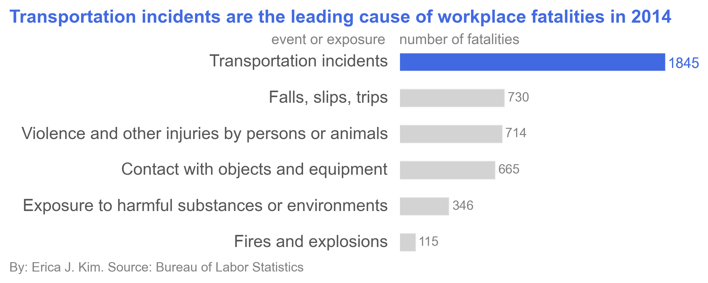
The above figure shows that Transportation incidents are the leading cause of workplace fatalities. This is not so
surprising, as transportation incidents are one of the leading causes of accidental deaths in the U.S.

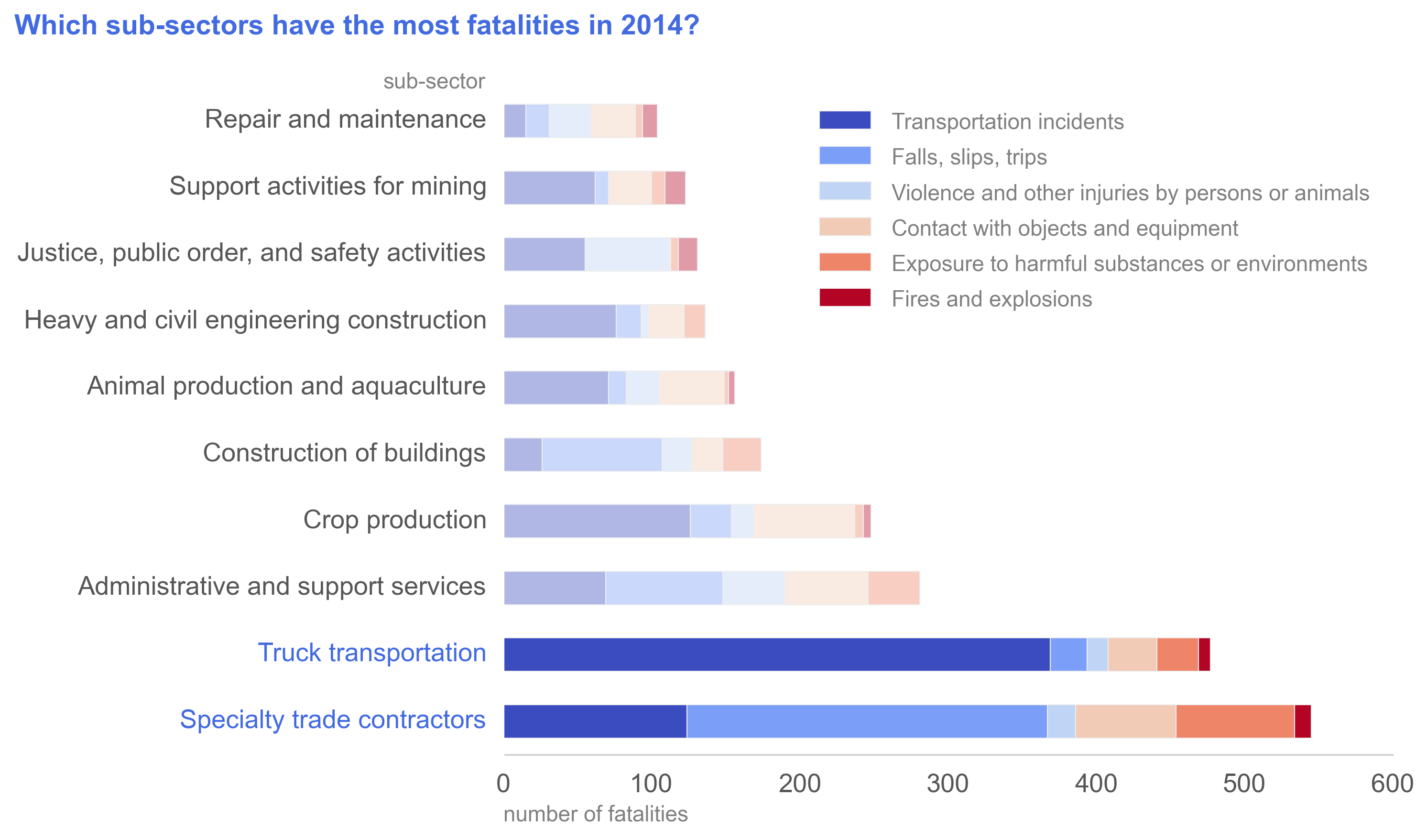
The Specialty trade contractors sub-sector and Truck transportation sub-sector have the highest numbers of workplace
fatalities in 2014. The leading cause of fatality for Specialty trade contractors was falls, slips, and trips,
interestingly. When you look at the
uninentional death statistics from the Centers for Disease Control and Prevention, however, we see that the order of
the top causes are: uninentional poisoning (12.3 deaths/100,000 population), motor vehicle traffic deaths (10.7/100,000),
and unintentional fall deaths (9.6/100,000). Because falls, slips, and trips is a leading cause of accidental fatality
in the general population, it is not surprising to see it as a major fatality cause for workplaces that don't specifically
deal with violence (e.g. Justice, public order, and safety activities) or dangerous heavy machinery (e.g. Crop production,
Support activities for mining, Repair and maintenance).
Conclusion
It's so satisfying getting some clear conclusions and pretty pictures from the original pdf!
However, there is so much more we can do with this data. We could get other datasets from the
Bureau of Labor Statistics to create a richer analysis. For example,
if we include a dataset that contains total employment numbers in 2014 for each industry, then we could look at
the percentages of employees, rather than the absolute number of employees, that
incur workplace fatalities. If we had time data, we could see trends in workplace fatalities, and determine
whether specific industries are getting more or less safe. There are a lot of routes of exploration we could take.
See part 2 of Working with data from the Bureau of Labor Statistics:
Job Openings and Labor Turnover Survey, or how to work with coded survey files
